Veganezzy
Vegan and eco-friendly products and services for vegans by vegans.
Overview
Veganezzy, based in Toronto Canada, is a subscription based e-commerce B2B and B2C company that provides vegan and eco-friendly products and services with an emphasis on local businesses. Veganezzy gives small vegan businesses a platform to promote and sell their products and services.
Role
UX/UI Designer, Team of 6
Tools
Figma/Figjam, Google workspace, Zoom
Problem
Users are leaving the website before even signing up by 80%. Elevate the front-end design to create a captivating and user-friendly experience that increases user engagement and retention.
Solution
Redesign the Veganezzy website to include a more modern and user-friendly interface that simplifies the management of merchant micro-stores, navigation, shopping and checkout experience.

Discovery
Confusing and Overwhelming Interface
While exploring the website, I identified opportunities for improving the user journey, ensuring smoother navigation, and reducing user errors. For example, there were several instances where I had a difficult time navigating the website which lead to unintentional clicks.
The interface lacked intuitive means for users to backtrack to previous pages or access specific product details, contributing to a less-than-optimal user experience.
Products, services, and information is cluttered and disorganized resulting in cognitive overload.
Client Questions
To understand Veganezzy better, we brainstormed questions for the client and we learned that the client was a big fan of Amazon and Esty, and was more concerned with the UI of the website. Although UI is an important aspect of a website’s design, we shared research and with the client that highlighted the value of functionality for success and user retention.
Competitive Analysis
To gain comprehensive insights into the competitive landscape, uncover market opportunities, and explore the world of prominent e-commerce platforms such as Amazon, Target, and Wal-Mart, as well as major vegan marketplaces like Thrive Market, The Vegan Kind, and GTFO It’s Vegan, I conducted a thorough market research.
GoBankingRates reports that people prefer Wal-Mart’s interface over Amazon’s because it’s simple to use and navigate.
At least 94% of Americans have used Wal-Mart.com to make online purchases.
A lot of vegan websites have a similar interface layout, information architecture, and navigation to Wal-Mart’s.
Heuristic Evaluation
Thorough a heuristic evaluation, we identified specific usability concerns that created frustrating scenarios for users resulting in website abandonment.
The current design had several navigation issues, lacked color contrast, and presented too much information that leads to cognitive overload.
Ideation
User Stories
We identified two main users of Veganezzy, the merchant and the consumer.
The consumer wants to have quick and easy access to information about products and services.
The merchant wants to spend less time figuring out how to use the website and more time managing their micro-store(s).
Using this information, we brainstormed user stories that highlighted the main issues experienced by users on Veganezzy.
User Flows
Guided user stories, we developed 22 different user flows. The client selected 3 user flows that best aligned with the company’s vision, market strategy, and user-centric objectives. The selected user flows helped the team identify what features, content, and screens needed to be redesigned to improve usability, simplify navigation, and create an overall better shopping experience for users.
Low-Fidelity Wireframes
A lot of our design inspirations came from well loved e-commerce sites like Wal-Mart and Thrive Market because they have user-friendly interfaces, good navigation, and they simplify the shopping experience for users.
During wireframing, the client reached out to us with another concern, “How an we help local businesses market and promote their products and services?” Initially, our design did not include any banners but to help the client solve this problem I proposed the concept of utilizing banners as a marketing tool for local businesses. Receiving enthusiastic support from both the client and the team this led to the integration of banners in the new design.

Design
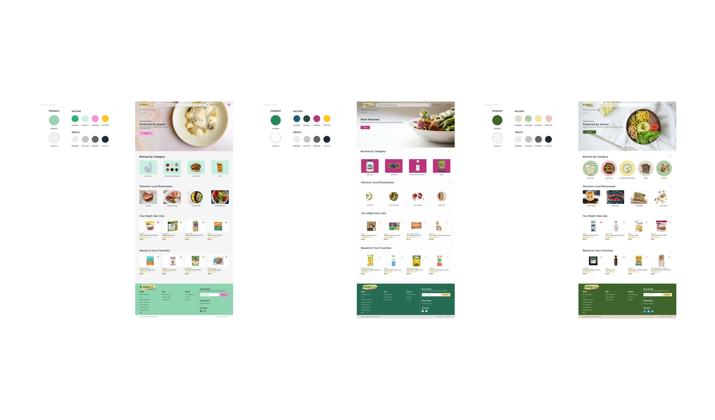
Color Exploration
Veganezzy’s current color palette was very bright, bold, earthy, and evoked memories of nature, however, a lot of the colors used did not meet WCAG contrast standards which is problematic because it’s inaccessible to users with disabilities.
To make sure Veganezzy is accessible to as many users as possible we spent several days exploring different color palettes that represented the brand’s bright, bold, and earthy tone personality AND met WCAG standards.
UI Iterations
Using the color palettes from the color exploration, my team and I crafted three distinct UI iterations for the client. To maximize creativity, we paired up in groups of two, recognizing that collaborative design often yields better design ideas. While the client expressed appreciation for all three designs, they ultimately selected option three as their preferred choice.
Style Guide
During the initial project brief, the client mentioned they had a style guide but when we requested the file they informed us that they didn’t have it anymore. After meeting with the project manager, we decided to create a style guide to ensure there was consistency across our design. The style guide consisted of a grid system, UI elements, typography, color palette, imagery, and a component library.

Hi-Fidelity Wireframes
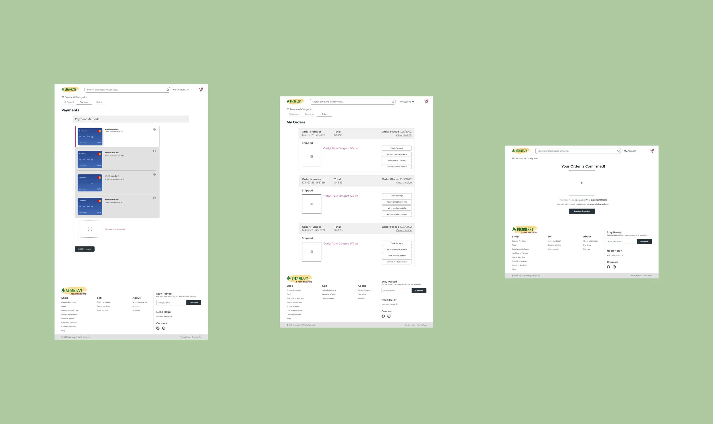
Using the client’s feedback and our style guide, my team and I began designing hi-fidelity screens. Since we had a lot of screens, 76, we made sure to use components and variants to ensure consistency across our screens.

User Testing
Prototyping
Despite the amount of screens, 76, we were able to finish prototyping in one day. We accomplished this through intensive collaboration efforts such as taking turns prototyping, helping each other out, and communicating any errors, adjustments, and ideas.
User Testing Plan
To examine user experience on the new design and identify any pain points, we conducted 5 unmoderated remote tests using usertesting.com. The tests were given to individuals of all races and social-economic backgrounds between the ages of 20-40. We developed a series of task and completion based questions for users to complete using the new design to assess usability.
Test Results and Redesign
After analyzing user tests, we identified two main issues.
Users had a difficult time locating the login and logout CTAs on both the merchant and consumer screens. To solve this problem we added an overlay drop-down menu when the user clicks on “My Account” in the header. This change gives users the freedom to login, logout, and switch between a merchant and consumer account.
When users were not logged in, there was an “Add to Cart” CTA on the homepage. This caused a lot of confusion among users because they could not add items to their cart. To solve this problem we removed any “Add to Cart” CTA buttons and replaced them with sale indicators. This way users are aware that they can only shop when they login or sign up.
Hi-Fi ver. 1
Hi-Fi ver. 2
Reflection
When I was working on this project, I also had another on-going project so there was a lot time management and communication with both teams involved. It was challenging to manage both projects especially on days when deadlines intertwined, however, I learned a lot and grew as a designer from this experience. I’m usually a reserved person who doesn’t like to ask for help and I try to figure it out myself, but from this experience I learned that it’s important to reach out when you’re feeling stuck because you’ll learn and grow into a better designer.
I learned to identify my strengths and weaknesses better. Sometimes it can be difficult to acknowledge that you’re lacking in certain design areas but I think it’s necessary for growth. Whenever I had free time in between projects, I would practice my design skills by searching up good examples of UX/UI designs and practice designing them myself. This helped me gain confidence not only in my design skills but myself as well.


