Chosn
Helping users become the best version of themselves for their loved ones.
Overview
Chosn, B2C, is a mental health website and mobile application that empowers users to deepen and enrich their existing relationships with themselves and others through community engagement and personal growth.
Role
UX/UI Designer, Team of 6
Tools
Figma/Figjam, Zoom, Slack
Problem
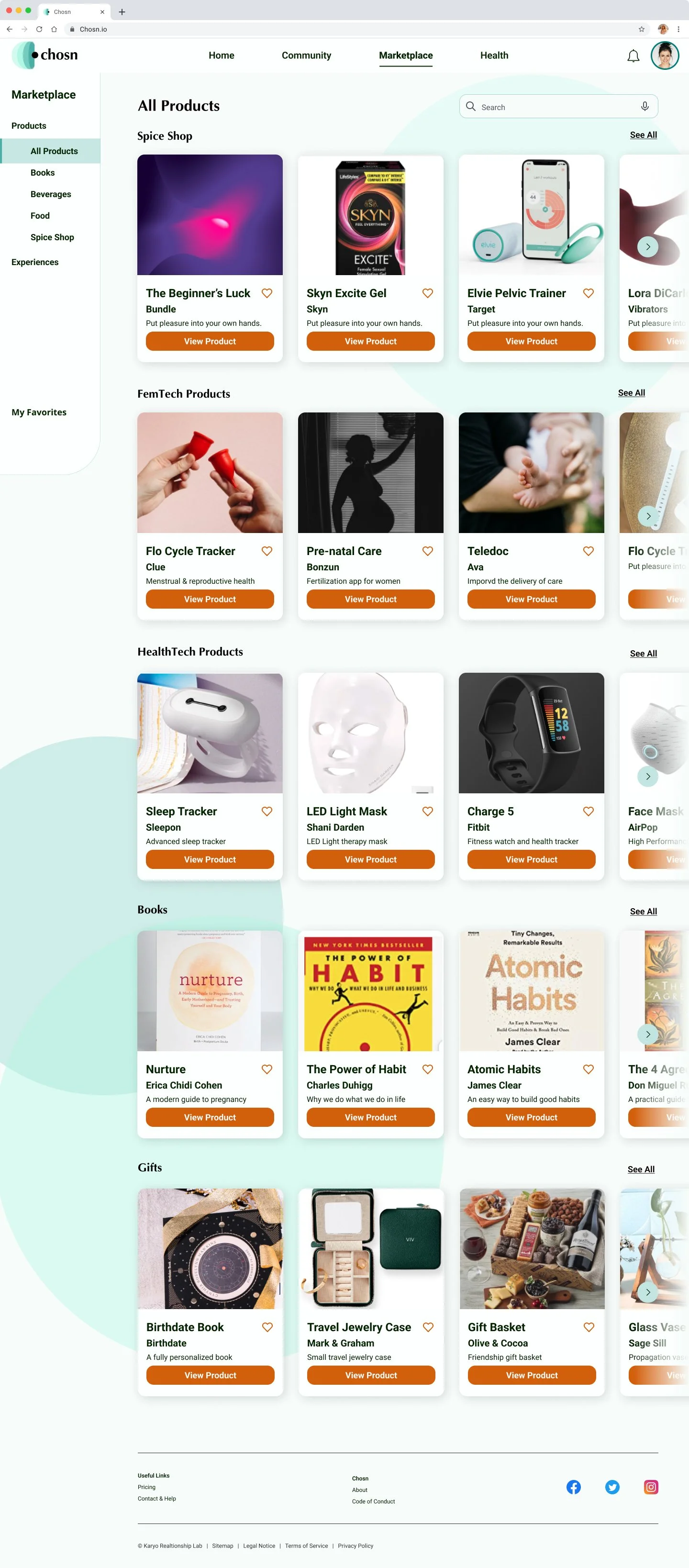
Enhance the user interface and introduce a dynamic marketplace that empowers users to discover an array of valuable resources (books, activities, mental health & healthcare specialists) to support their personal growth.
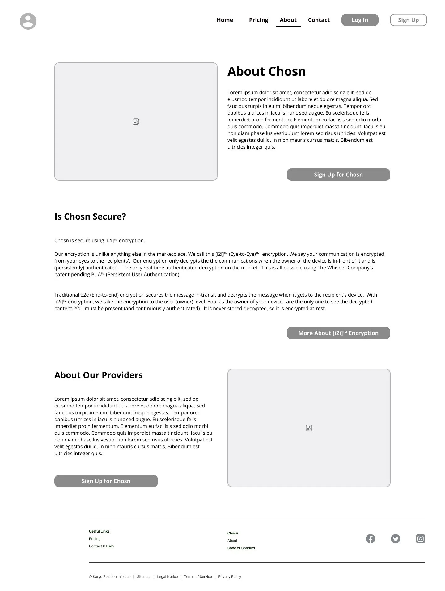
Help implement whisper technology to protect the privacy of users to build brand trust thus increase user engagement.
Solution
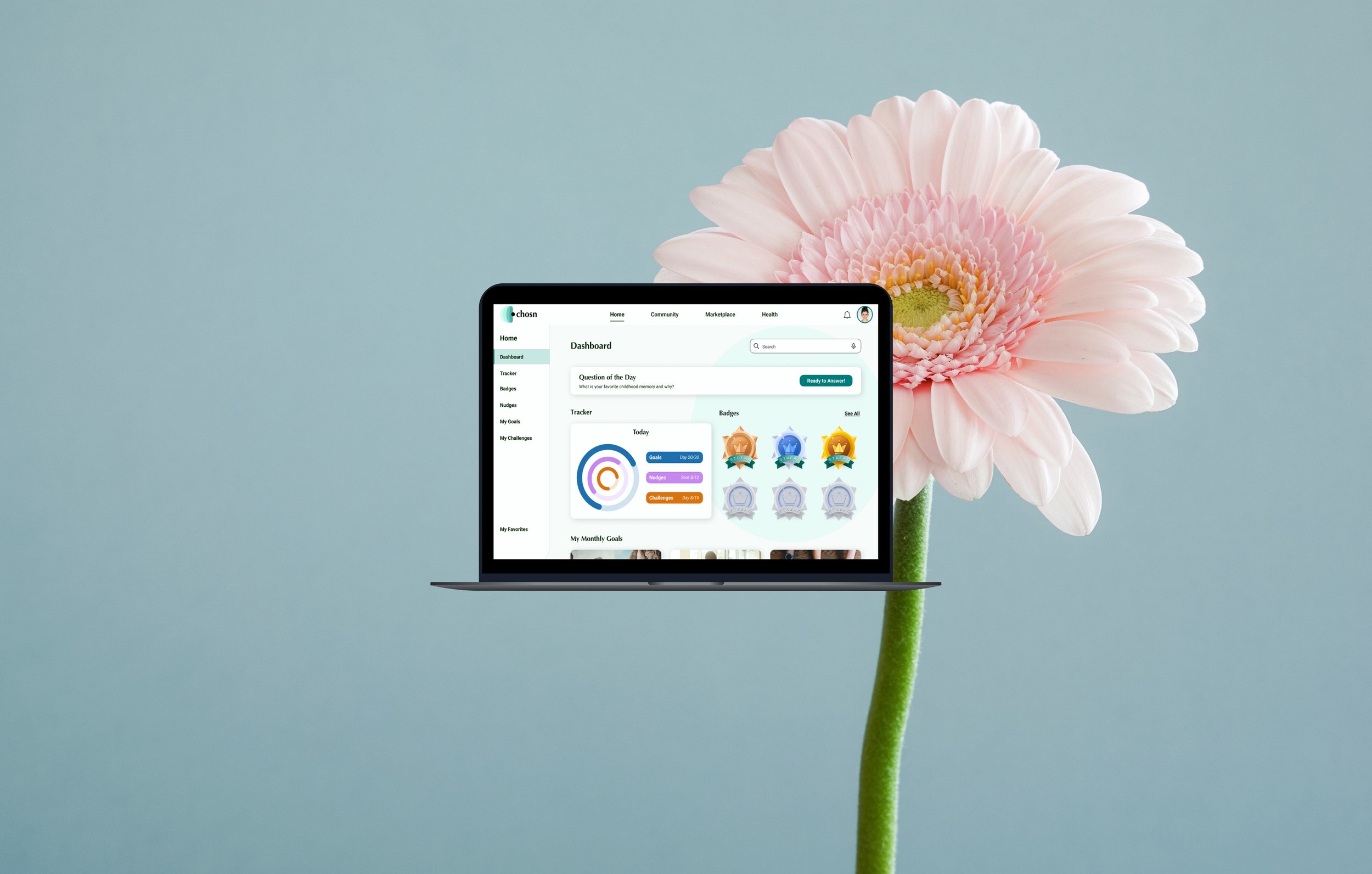
Redesigned the community dashboard, homepage, about page, and design & implement a market place feature from scratch that provides user with easy access to a variety of personal growth resources. The new design includes a more modern and user-friendly interface with all the resources users need to empower their growth.

Discovery
A Confusing and Overwhelming Interface
Information hierarchy was not heavily considered in the earlier states of design thus resulting in a busy and overwhelming user experience.
For example, the tracker feature which helps users keep track of their goals and accomplishments was placed at the bottom of the page but it’s an essential feature that users should have quick access to.
Client Questions
To avoid making similar mistakes and understand Chosn better, we asked the client about previous user testing and feedback. So, what did we learn from the client?
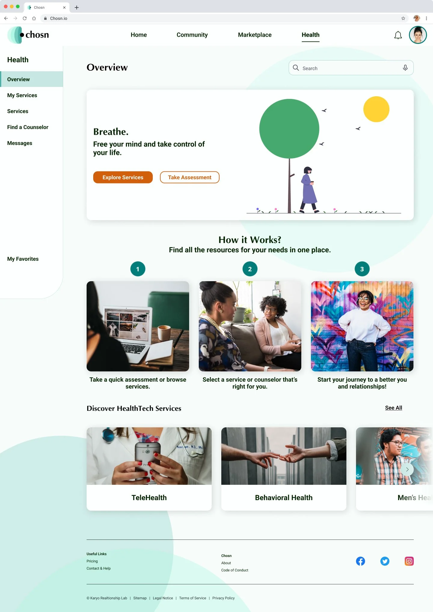
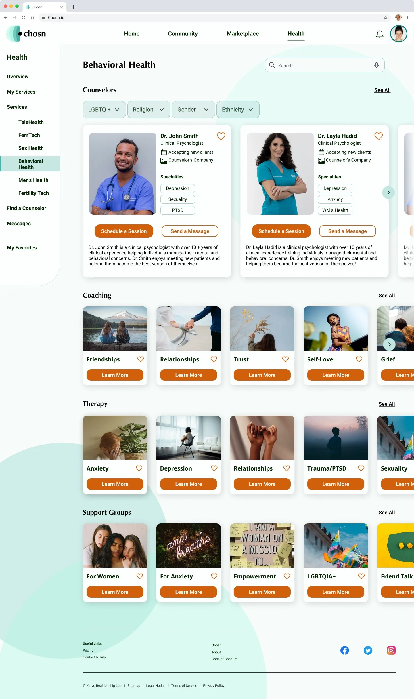
Users should be able to find all the healthcare resources they need to empower their growth in one place.
Users value privacy and they want their messages with community members and providers to remain secure and protected.
Design a user-friendly interface that is easy to use, navigate, and increases user engagement.
Users Love Simplified Healthcare
I spent a lot of time researching competitors such as For Her, Psychology Today, Rosy, and K Health to understand the industry and potential users better. Through research, I found that users value having control over their healthcare and they like these particular websites & mobile applications because they have a intuitive interfaces that simplify the complexity of mental healthcare.
For example, K Health makes it easy for users to receive both therapy & medication at a very affordable price without the hassle of typical office visits.
Ideation
User Stories
We initiated our project by conducting extensive research and subsequently crafted user stories that targeted the community, marketplace, and mental health aspects of the websites. These user stories formed the foundation of our project plan, guiding us to design a highly functional and user-friendly product.
User Flows
To tackle the challenge of developing a new feature, we used user flows as a strategic starting point. Through a process guided by client feedback and user research, we fine-tuned our design direction, ultimately identifying the key features, screens, and experiences that addressed user pain points.
Wireframes
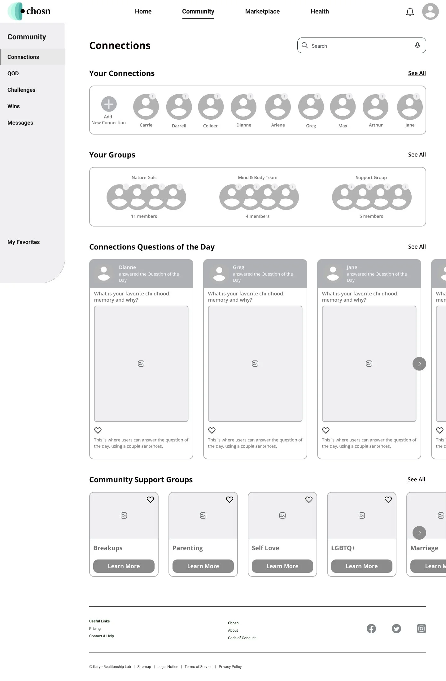
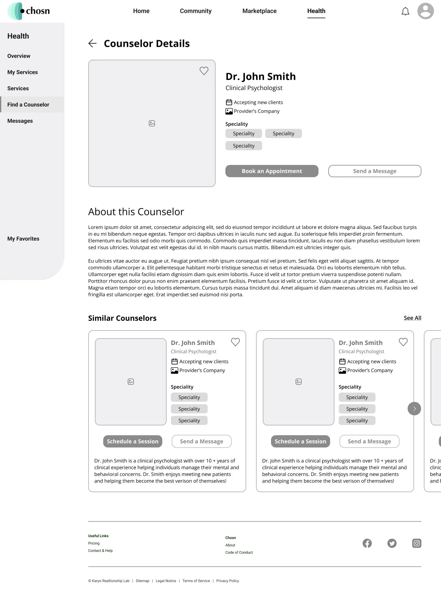
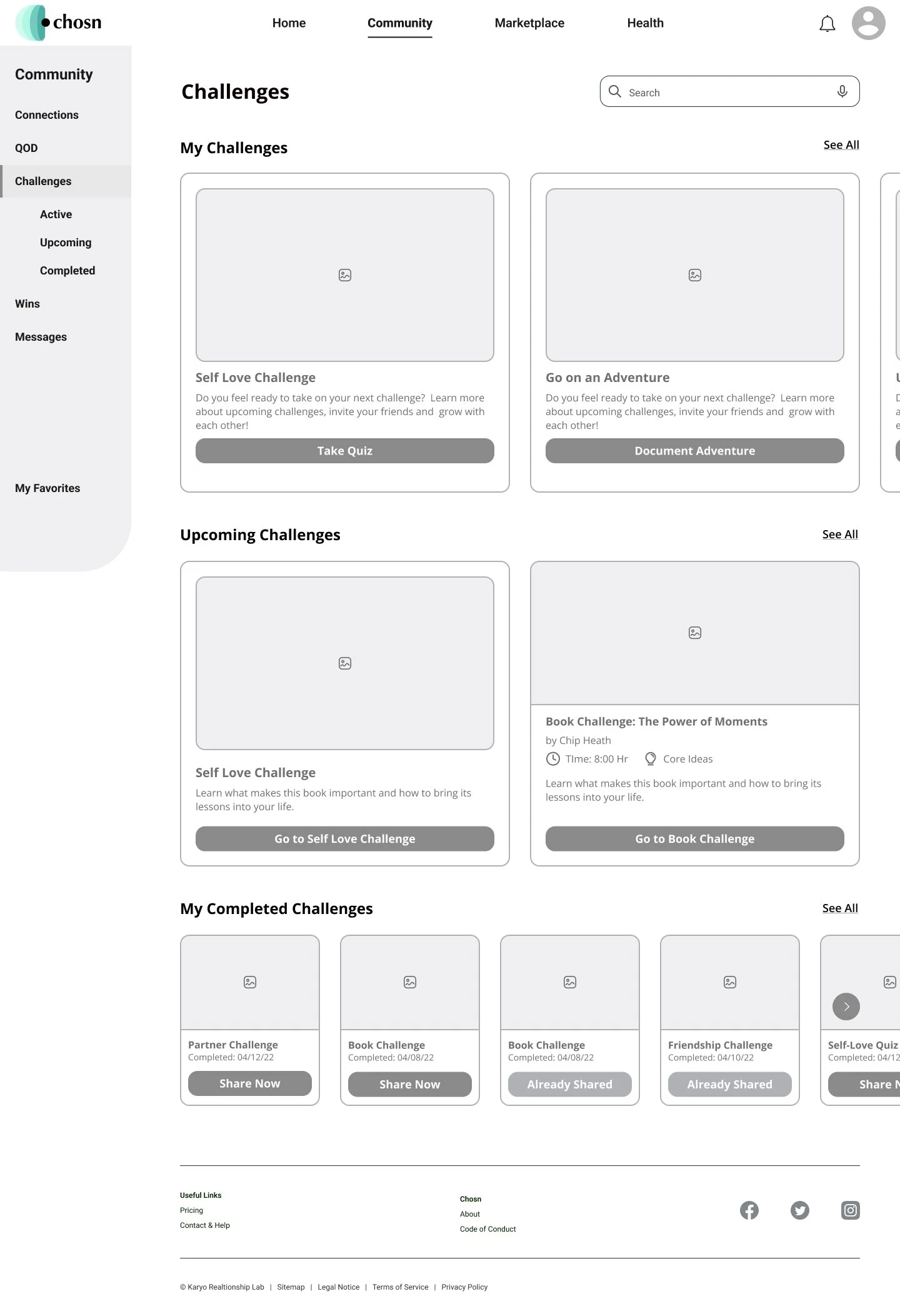
Our low-fi wireframes played a pivotal role in establishing the foundation of the new interface, strategically implementing information hierarchy principles to simplify and declutter content. While we considered client feedback and incorporated minor adjustments, some design decisions based on research remained non-negotiable.
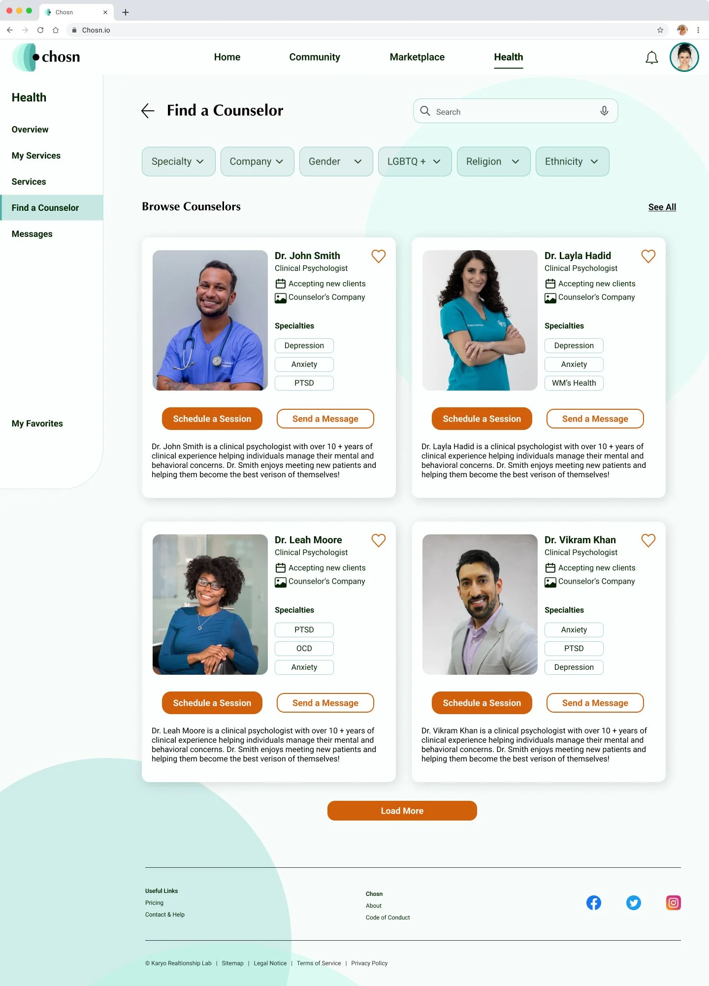
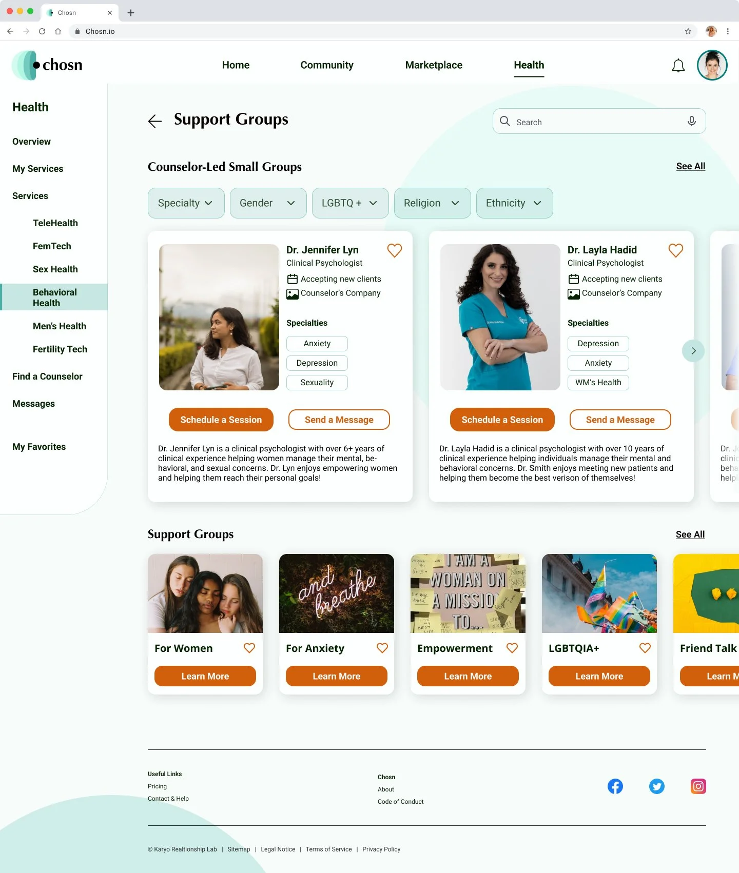
For instance, I introduced a filtering feature allowing users to refine health providers by specific attributes like gender, sexuality, and ethnicity. Initially, the client was hesitant to approve this feature. Leveraging wireframes, I was able to illustrate the significance of user control in enhancing their healthcare experience and why such filtering options were essential.

Design
Style Guide & UI Iterations
Our client had a specific style guide they wished for us to adhere to, which included a requirement for circular elements behind the screen content. We made a concerted effort to seamlessly integrate these design inspirations into our UI iterations, ensuring a harmonious alignment with the client's vision and guidelines.
Hi-Fidelity Wireframes
We prioritized design consistency by incorporating components into all wireframes and creating a comprehensive spacing guide. In addition to consistency, we made sure to design page experiences that
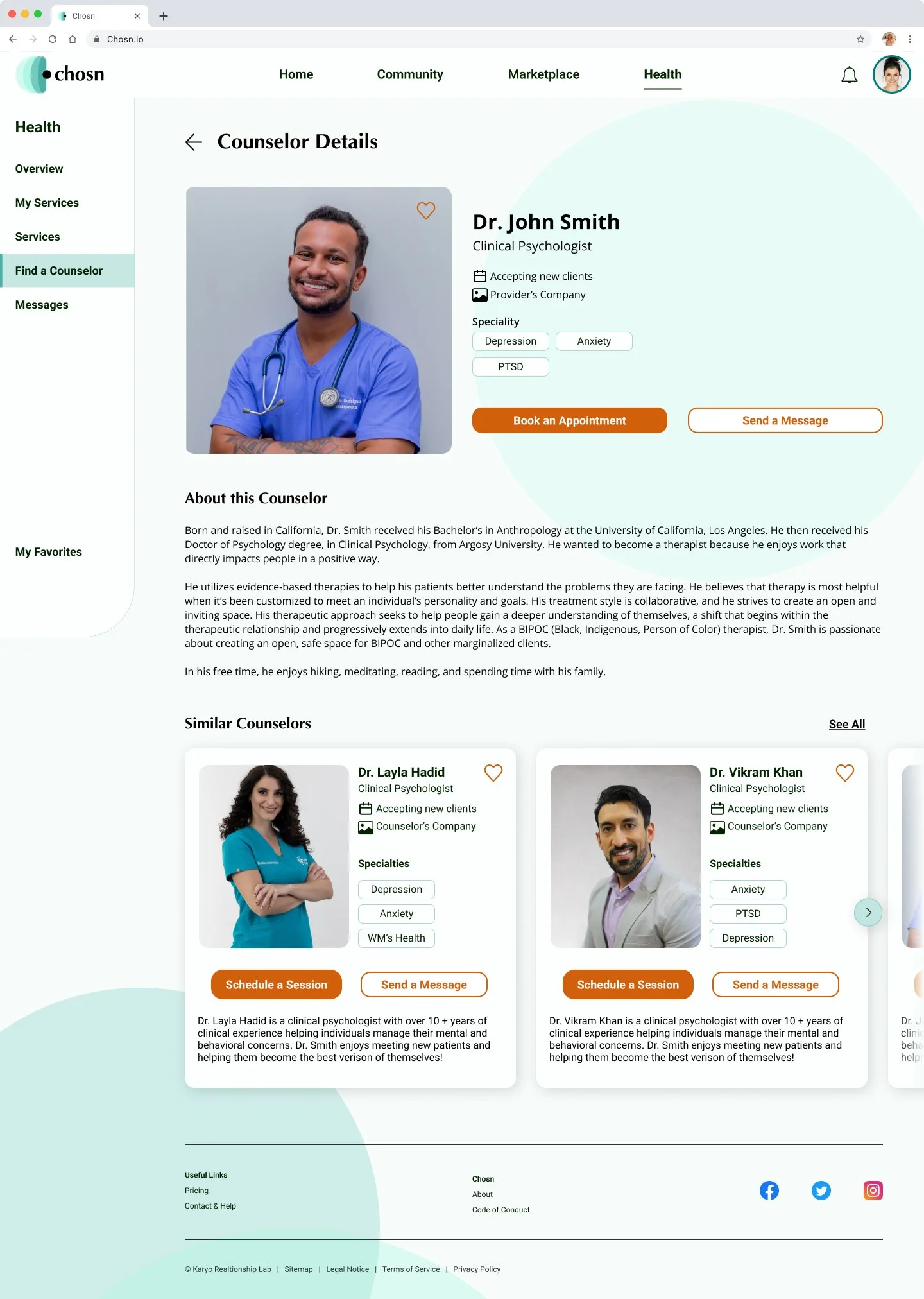
Incorporate information hierarchy with the most relevant information and content at the top of the pages.
Reduce cognitive load by minimizing irrelevant content, prioritizing important content, and presenting information in an easy to digest manner.
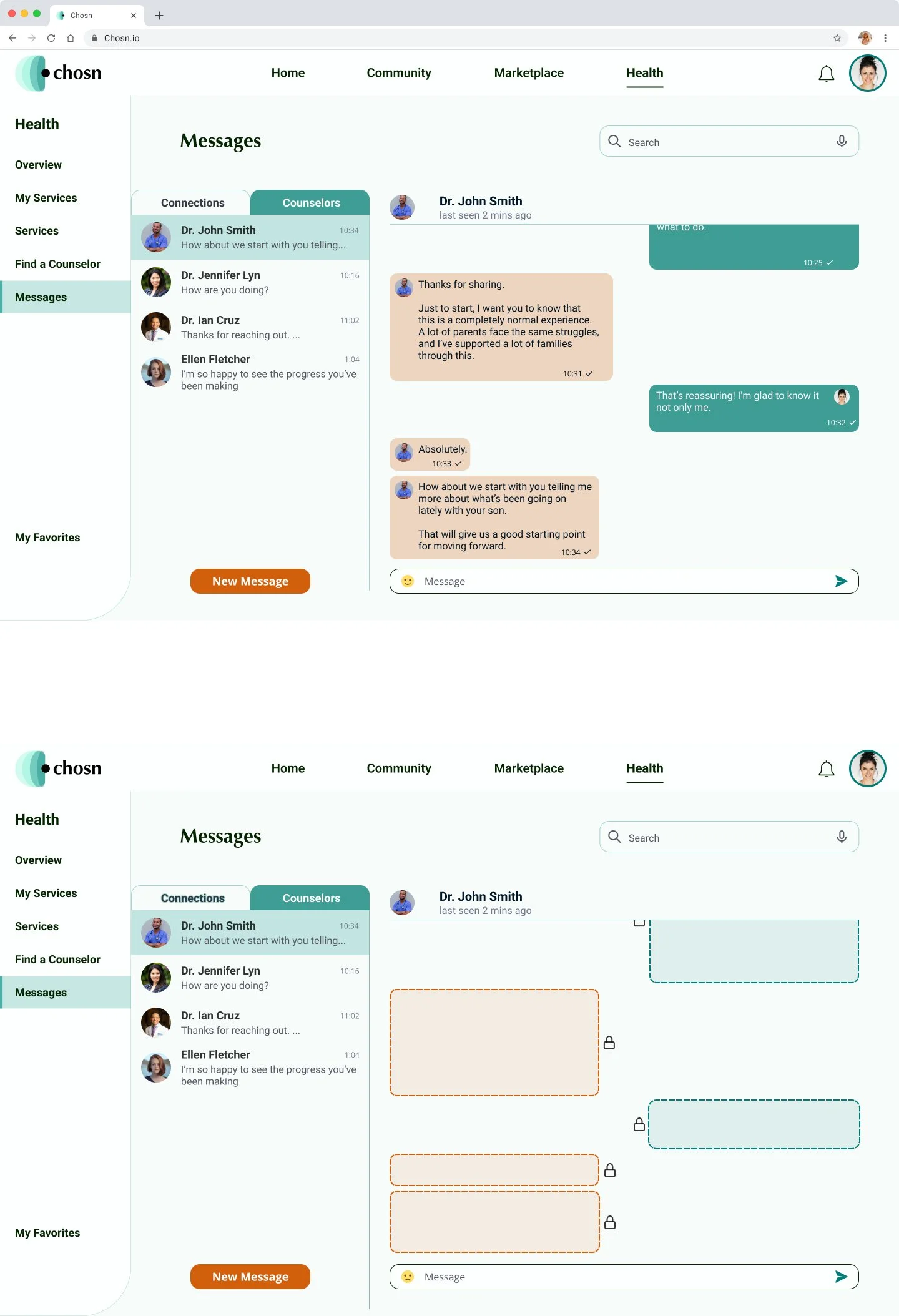
Give users control over their privacy through the implementation of a vanish mode in the messengers tab.

Developer Handoff
Prototype
After finalizing our Hi-Fi screens, we began prototyping. It took us one day to prototype and it wouldn’t have been possible without lots of Cappuccinos and team work. Although we didn’t get to test out the prototype, my team and I worked really hard to make sure the prototype was to be used in usability tests and additional research.
Developer Handoff
The project concluded with a developer handoff. We annotated the screens with proper spacing, padding, font sizes, colors, etc., requirements and we included descriptive annotations for certain design elements, and interactions in case the developer had any additional questions and/or concerns.
Reflection
Working on this project has brought me immense fulfillment as it gave me an opportunity to utilize my background in psychology, science, and healthcare to advocate for users while fulfilling business requirements. Despite the challenges of creating a new feature from the ground up, I am thankful that my team lead trusted in my abilities and urged me to seize this opportunity. I have gained valuable insights, with one of the most significant being the confidence to assert myself and stand firmly by my design decisions. Overcoming past struggles with imposter syndrome has empowered me to comfortably propose ideas, pitch suggestions, and defend my design decisions.
